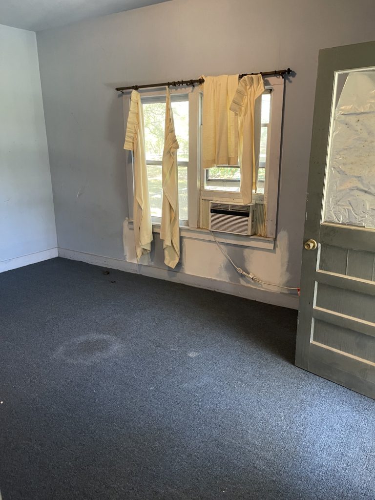
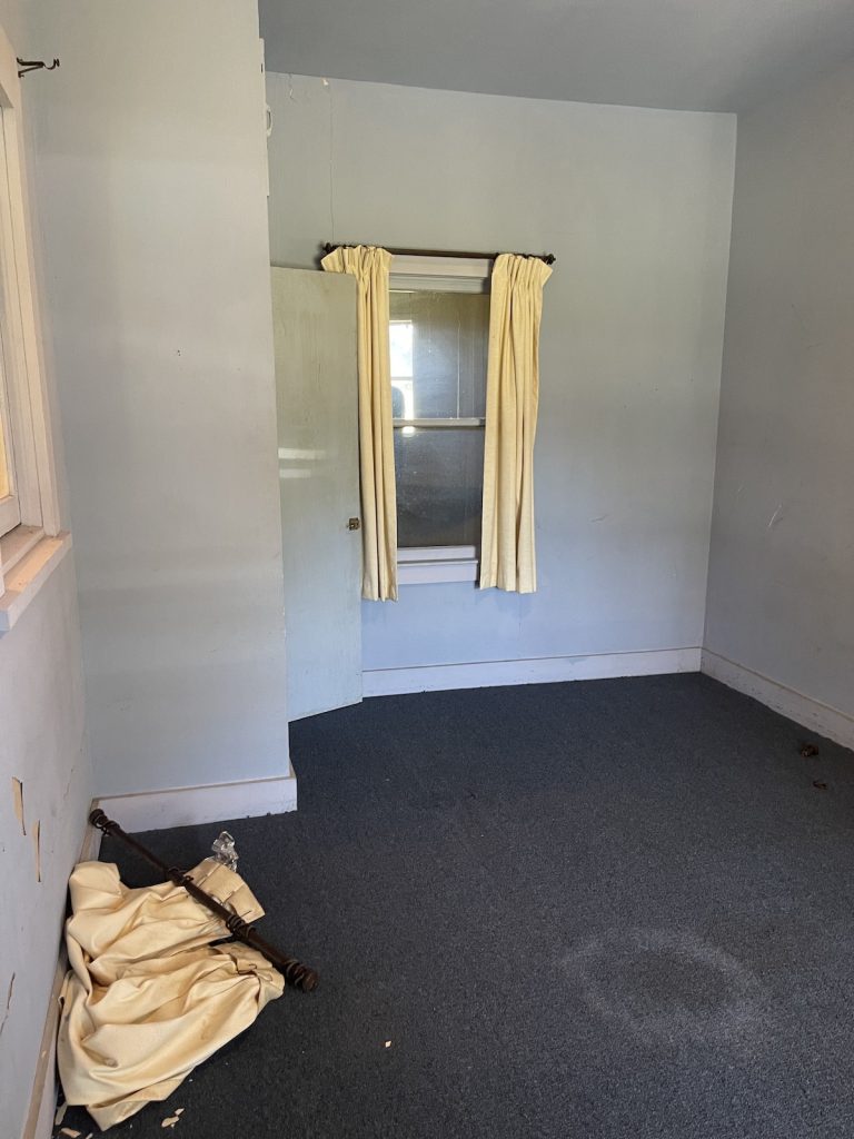
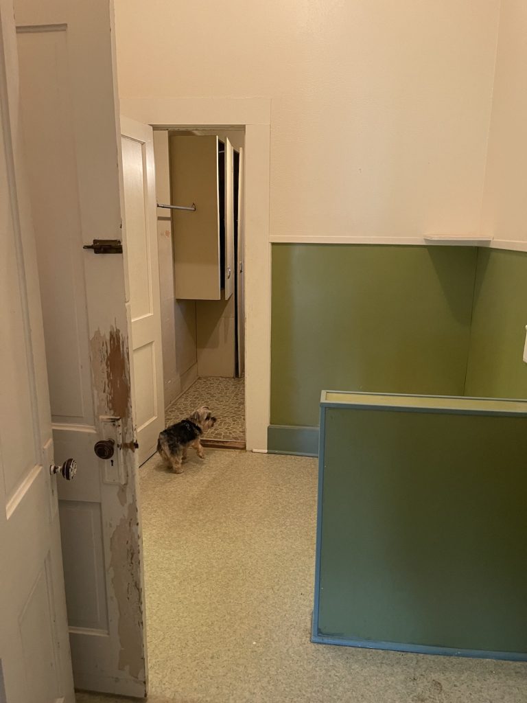
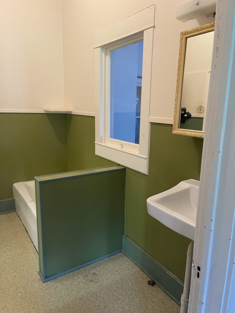
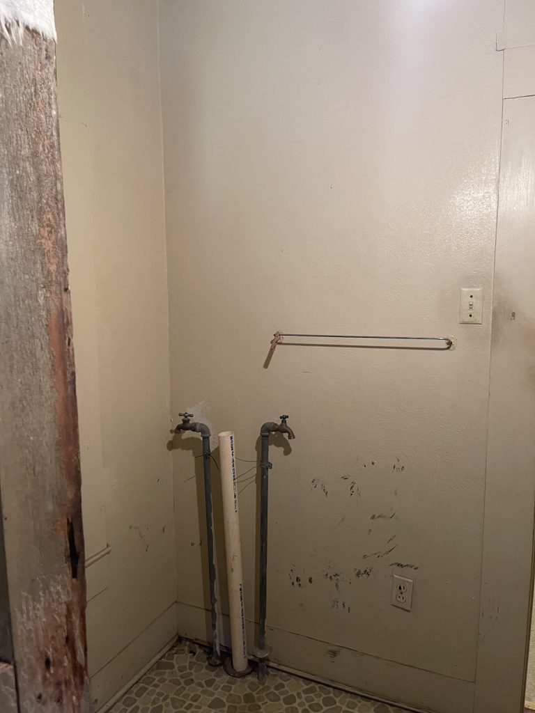
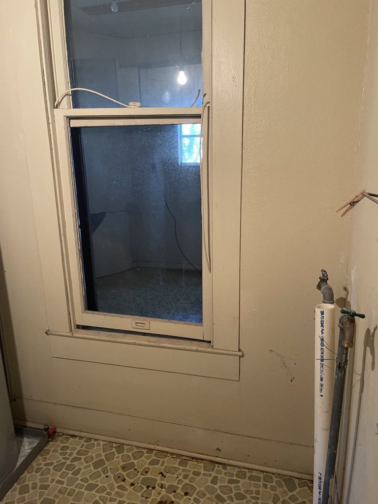
In my previous post, the main portion of the home was shown but many additional areas needed redesign. The second and third bedrooms and all baths needed new designs, the laundry room (which was a water closet) had 2 doors in a tiny space and the second bath had a window and 4 doors in it. The rooms were opened up where it was possible without reconstructing the entire home.
The idea was to draft the kitchen, using mostly old European furniture pieces purchased in Round Top, but as the design got underway, there were several changes to accommodate more cabinet space, less furniture pieces, and a wall in the kitchen that had a protruding closet from the guest room. Creativity became the basis for each draft, while keeping the client’s needs at the forefront.
Eventually as you will see, the refrigerator sits on the wall enclosed by cabinetry surrounding it. I gave them the option of library open-shelving or enclose everything for a cleaner more modern look. The kitchen is very small so when it was put back together the idea of moving the refrigerator on its own wall became a centerpiece of discussion. It could either be close in proximity to the work area or, accommodate the desire for extra cabinets and move it to the other side, which is what the clients decided. As long as the design flows cohesively, the main concept is achieving clients desires.
In addition, the kitchen sits in the interior of the home, with almost no natural light touching it. It also has 3 doors to the perimeter of rooms, one being the dining room. Based on the work load, barring walls and design flow, it was logical to open the wall to the dining room for flow and maximum light. Originally, the concept was to arch the entire wall to the dining room and have a free flowing area, however, the client preferred a partial arch to accommodate an antique hutch that would sit on an adjacent wall. So we did a partial opening with an arch and it still gave us additional light and an openness to the dining room.
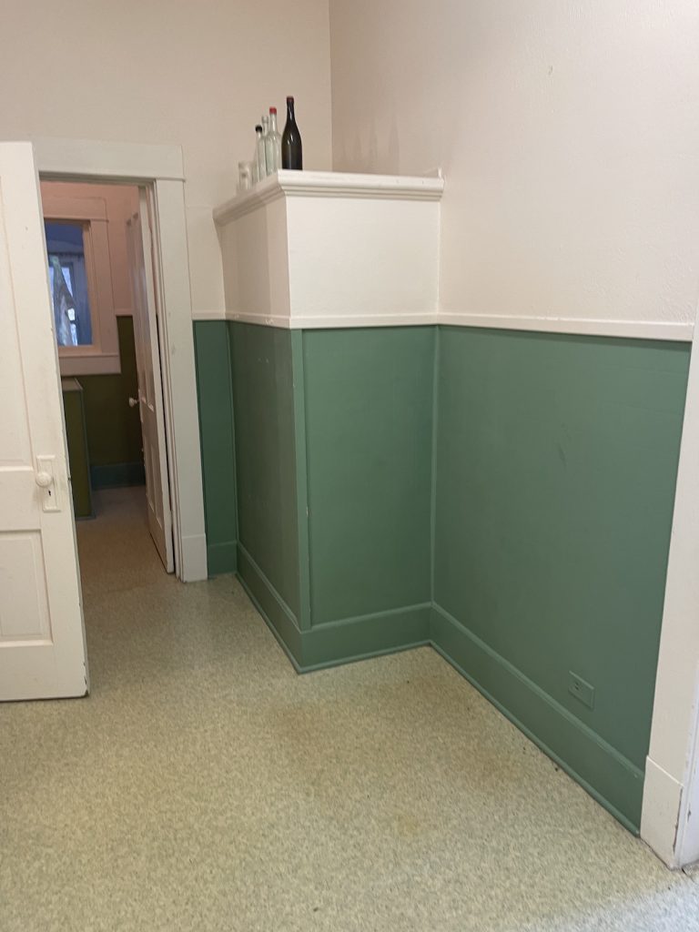
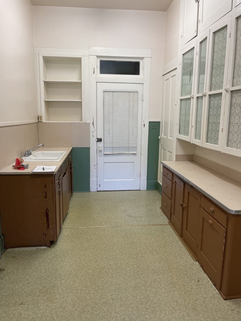
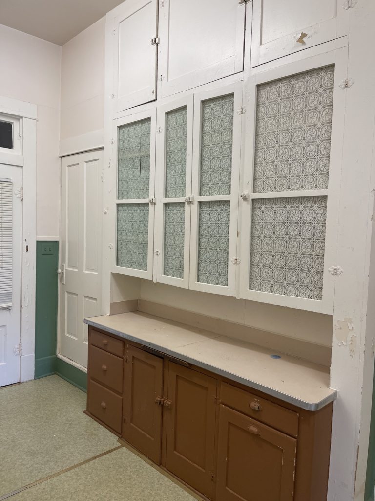
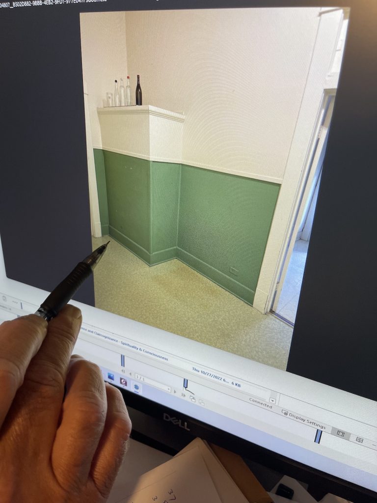
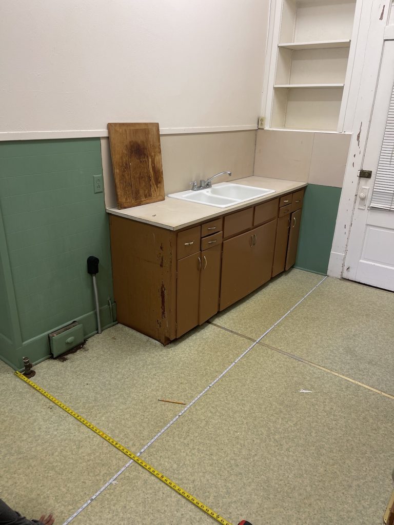
Below are the photos of the original kitchen. Starting on the left TOP Row, the wall with the protruding closet of the guest bedroom, the main kitchen area and a close up of a focal point we will make in the kitchen. Literally, the kitchen was very small and we had to redesign the entire area, without really expanding it.
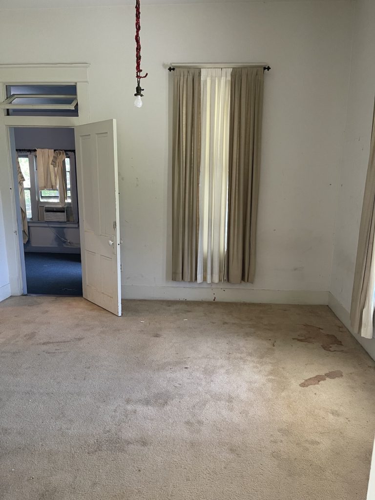
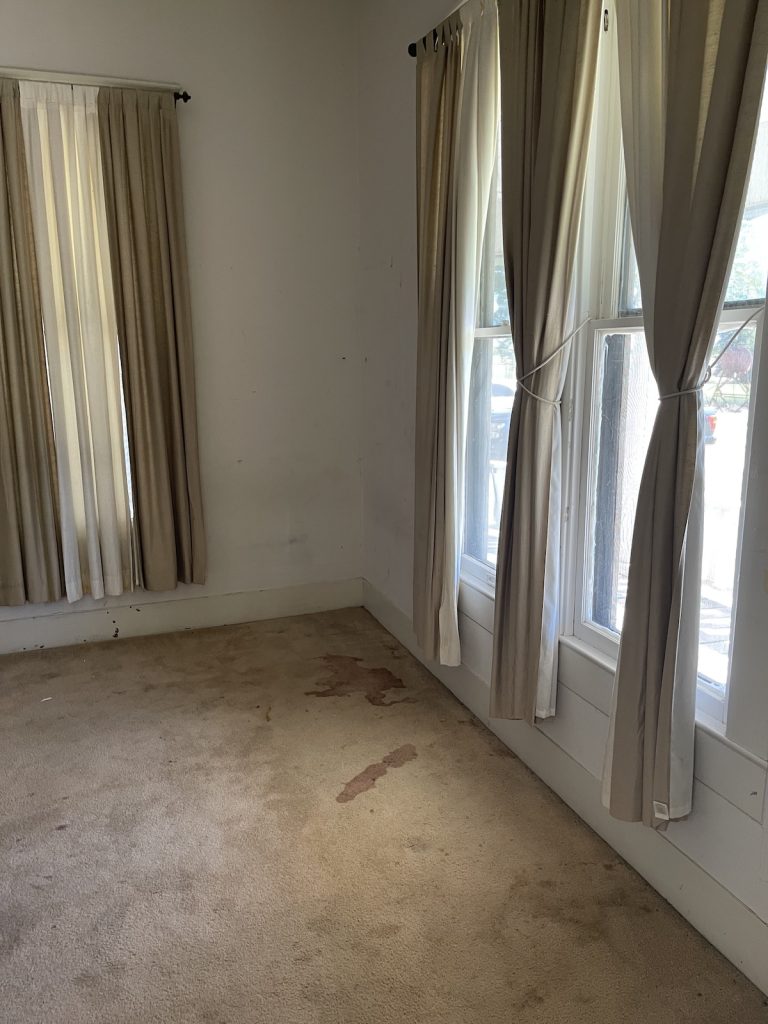
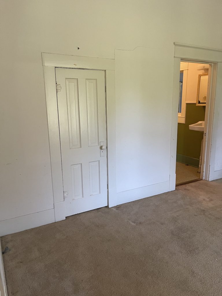
Below are also pictures of the guest rooms, guest bath and a hot water heater closet that would become a laundry room.


